

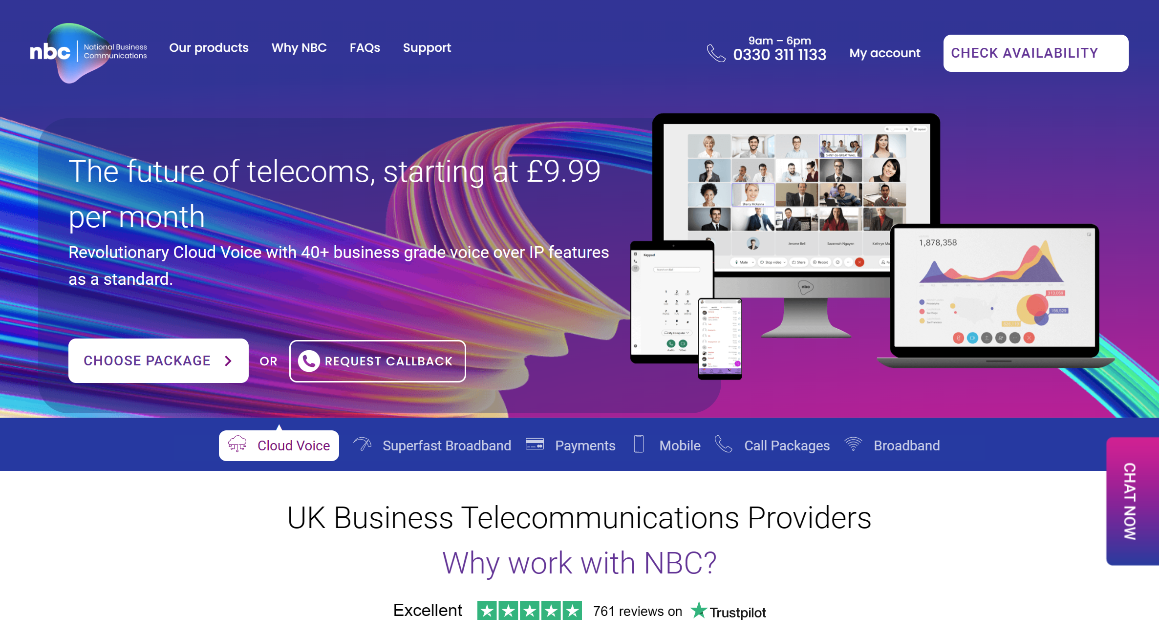

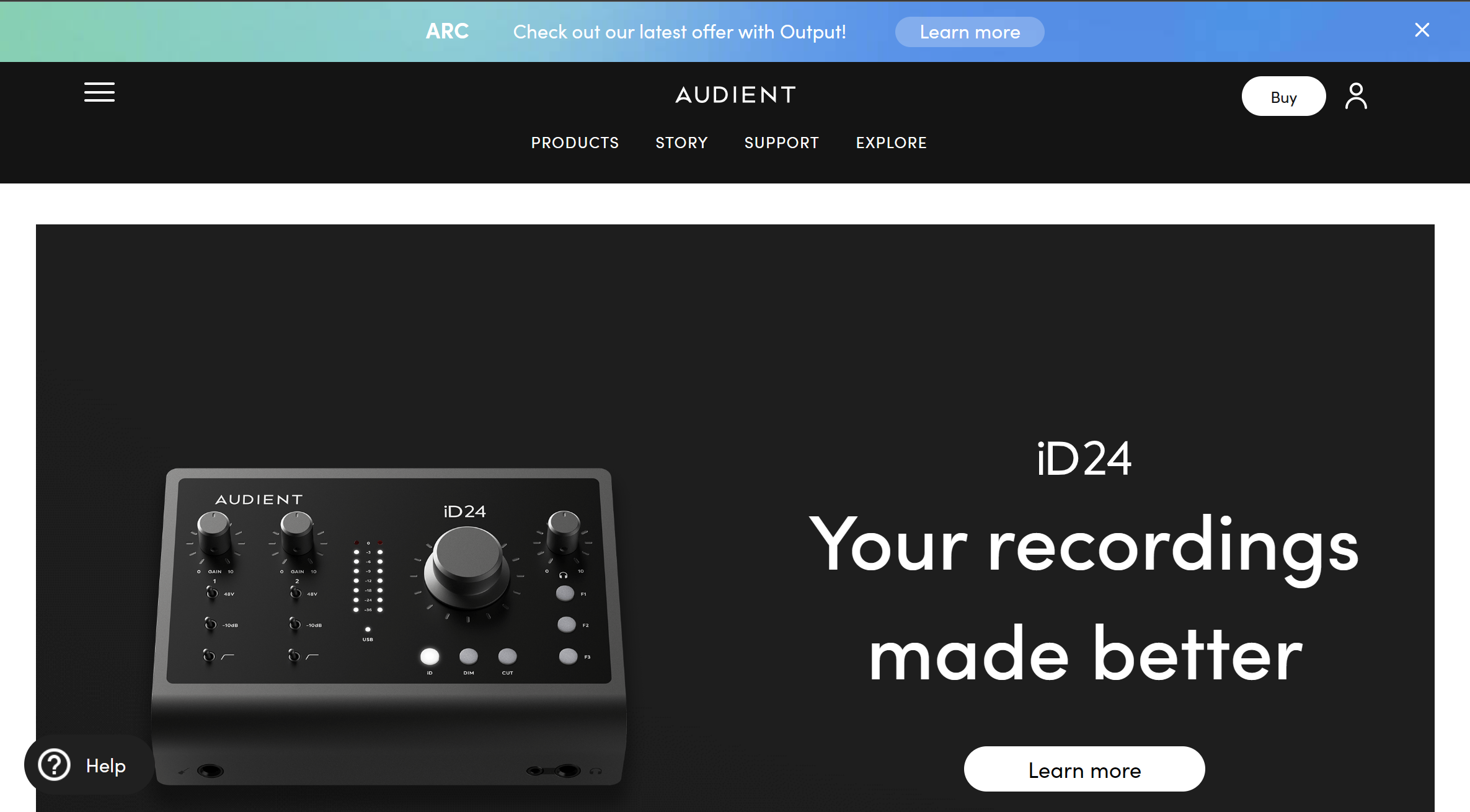
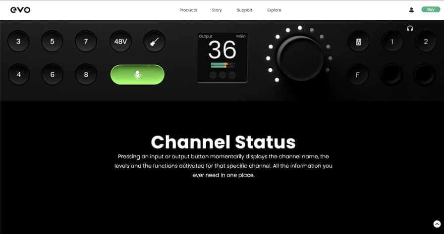
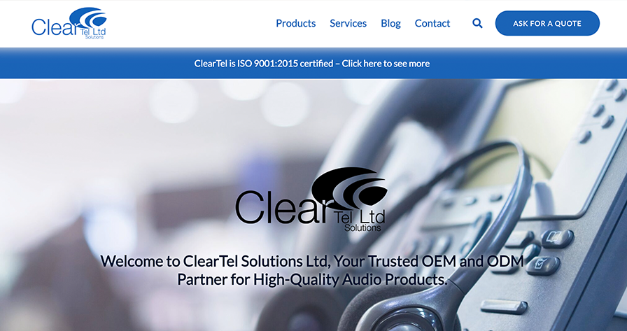


OrbitCarrot led a complete end-to-end rebrand of ClearTel Ltd, a leading voice solutions company in High Wycombe, Buckinghamshire. With the website, data sheets & instruction manuals branding, digital played a huge role in contributing to the overall rebrand.
Goals:
- To mature and modernise the business’ brand
- To act as a lead generator
- Improved website UX to help product discoverability
- Optimise for all types of device (mobile, tablet, desktop)
We started the re-branding journey by maturing the main branding colours by introducing two new darker colours, and replacing the 2 secondary brand colours with just one singular colour. These colours add a better left of dept and a nicer contrast with more practical uses.

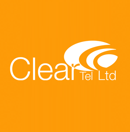
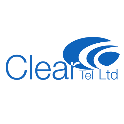
The client wanted an evolutionary logo change, one which was instantly recognisable but with a fresh overhaul. Firstly replaced the town toned blue style with a singular blue from the colour pallet, we also removed the dated shadow effects. We then replaced the typography for a cleaner lighter modern font. Last but not least, we improved the non-textual logo by keeping each section in the same direction, this better represents sound waves – giving reference to the voice solutions they offer.
As the logo is a single tone of colour, this means we could easily create a white version of the logo, which can be displayed on the darker blues we introduced to the branding colour pallet.
[ezcol_1third]
[/ezcol_1third] [ezcol_1third]
[/ezcol_1third] [ezcol_1third_end]
[/ezcol_1third_end]