


How a non-mobile website gives my competitors the edge?
In this article we’ll explain why it’s important to have a mobile friendly, and what your options are with creating one. Mobile device usage has exploded in recent years with over 60% of the web’s traffic coming from mobile devices.
Smart phones are essentially glued to people’s hands, and most of those will be surfing the web, checking emails or on social network apps. If they’re surfing, then you need to make sure you offer the best experience for the device which they are on. People shouldn’t need to zoom in and pan around to read your content, equally people shouldn’t be greeted with “you need Adobe Flash to view this content” or hover menus which don’t work on touch devices.
People have short attention spans, so your potential customers will likely move to an easier to navigate website. Now we know that potential customers could ditch your business just because it’s not mobile friendly, but this is just the beginning, on thee 21st of April 2015, Google upped the importance of this be announcing that they will be prioritising websites that provide a better mobile-friendly experience. Or to look at this from the other way round you’ll be penalised for not having a mobile website. Customers will not only ditch your website, but competitors websites will rise above yours for being mobile friendly.
What is a mobile site and how to I create the best mobile experience?
Ok i’m in! So, what’s a mobile friendly site and how can I provide the best experience to keep customers and keep Google on my side?
We won’t bore you with detail, but in short a mobile friendly site is a website that changes it’s appearance and layout based on which device is it viewed on, so on a phone the website will be longer, with large enough to read font all without needing to zooming and panning, just scrolling, it will likely have a menu button (often the hamburger menu).
You are able to change the content which is displayed, the menu structure (often you remove sub-menus or sub-sub-menus) and how the site operates based on the device it’s being viewed on.
To create the best mobile experience you have two choices; you either have a separate mobile website, or you have a responsive website.
Responsive Website
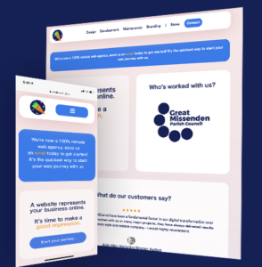
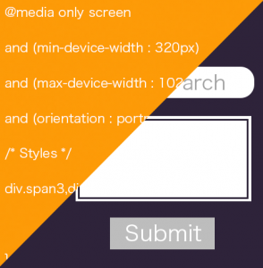
A responsive website is the most common way to create a mobile friendly site. Responsive means that the website adapts to the device that it’s being viewed on. The website uses media queries which is a set of rules which changes the styling or layout at certain widths, a long with flexible grids and percentages to get a fluid experience. You can check if a website is responsive by resizing your web browser’s width and seeing if the content adapts to the new size. At OrbitCarrot we now only produce responsive websites!

Separate Mobile Website
Creating a separate mobile website is very different to Responsive web design, rather then having one website which adapts to the screen size, this method involves creating a completely new website for the mobile site.
The mobile website will normally sit on a subdomain such as /m or /mobile and the user will be directed to this version of your website when using a mobile device. This approach is often chosen when you want to keep you existing website as it is (or when there will be far too much work to make a website responsive), this approach however does create more long term maintenance, as you have to maintain two website. Some companies even opt for a desktop website with companion apps for Android and iOS, this approach however will not help stop Google penalising your website unfortunately.
What’s the next stage?
If you don’t have a mobile friendly website then we highly recommend you talk with your marketing agency or web developer as soon as you can. If you’re not sure who to talk to, please do contact one of our specialists today! Remember over 60% of the web’s traffic is for mobile devices, do you really want to exclude over half of your potential market? Even if you have a mobile website it is worth evaluating it to ensure you are providing the best user experience for your potential customers.